SABC Set for the 2010 Fifa World Cup
Red Carpet Set
3Talk with Noeleen Set
Rowdy Set

Fridays Live Set


When comparing all five TV sets, I would say that the best
visual impact is between the the SABC, Red Carpet and 3Talk Set. The SABC
stands out because of it massive ample space which in addition has a very functional
and interesting spatial layout. The arches are a feature which enhances this
impact. On the other hand, the Red Carpet is classy and glamorous which creates
an expensive atmosphere. The layout of this set is very simplistic and moderately
functional. It comprises of 3 main areas which almost merge into each other
thanks to the light-pattern grid prop. However, 3Talk has a more functional
spatial layout because everything sits on one multi-platform space, which is
not as big as the SABC Set. On the contrary, Rowdy Set’s spatial layout is not
functional because it gives the impression of being quite scattered. Besides,
most of the props and furnishings are not aesthetically pleasing either. The
Set for Fridays Live gives a cheap visual impact due to its furnishings and
props and is very small in size. Nevertheless, credit must be given to the
student’s who not only built this set but managed to produce good
constructional techniques as it is both assembled and disassembled in each of
their shows. The best lighting is seen in the SABC set with use of vibrant
colour changing effects in the pillars at the back with ROBIN 300 Washes.
3Talk’s lighting is SABC’s opposite, in white bright light. Due to the
whiteness the colours don’t work well with the set, even yellow lighting within
this set creates an unattractive warm feeling.
As regards to Unit 17, I started to experiment with cheap materials such as paper, cardboard, and straws to create different possible designs for our 3 proposals of the Pavilion Seated Structures.
Proposal 1 Development
Starting from one shape of this type of folding almost like a terraced design, I made use of two identical shapes to be able to play around with the layout of the Pavilion. The images show the development of the possible outcomes...


Idea 1
Idea 2
Idea 3
...leading to Final Design
The reason I chose this format is because it has a stronger element than the other two. Despite having two symmetrical shapes, in this layout I managed to alter the design into not making it look symmetrical at all. The shape makes it interesting for the people to walk under one section to sit at the other end, from where the seating is created through its design of the terraced element.
Final Design of Proposal 1
Proposal 2 Development
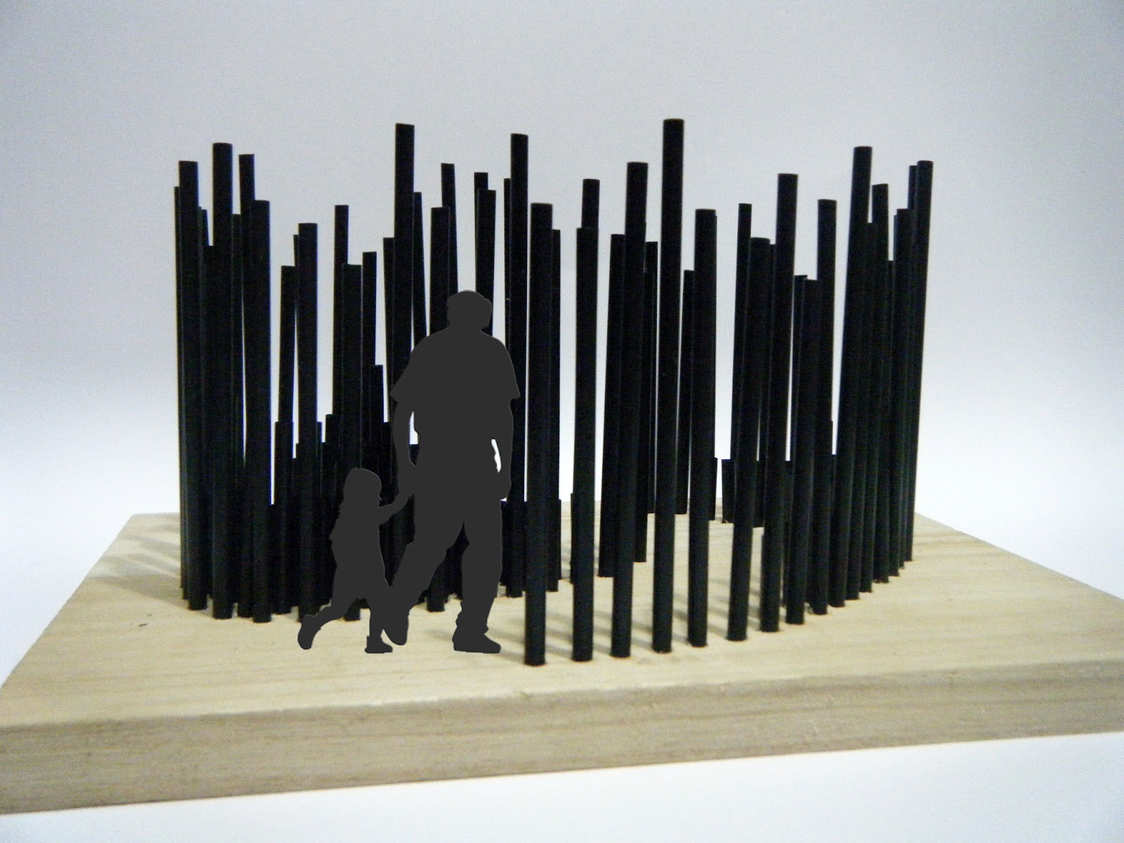
For my second proposal I decided to use straws to create a concept of continuous rods which vary in height, and thus reflecting the idea of movement within the Pavilion's structure. Also the seating inside is done in an inclined format to enhance this movement created, and also to better interact with the Pavilion's structure itself. The reason that the rods are evenly spaced apart is to install a lighting in between each rod to project the light upwards to ultimately create an interesting atmosphere with the lighting and shadows being created here.

Idea 1 leading to...
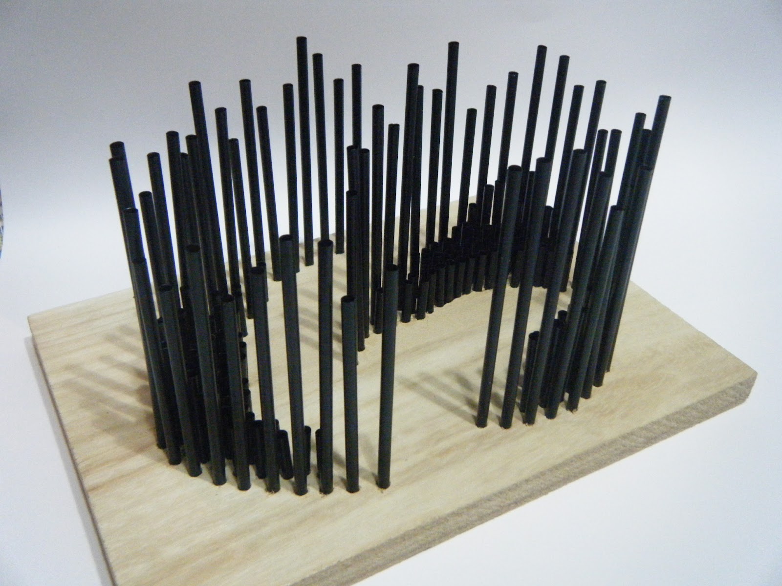
Final Design of Proposal 2
Proposal 3 Development
And finally for my last proposal, I designed a Pavilion which reflects the idea of complete relaxation. Its curved shape is achieved from a single sheet in equal panels intertwined into this form. The relaxed atmosphere is emphasized with the type of seating running along both sides of the central loop being 2m long.
Idea 1
Idea 2 leading to...
Final Design of Proposal 3