
Tuesday, 24 January 2012
Monday, 23 January 2012
Final Pavilion Design
Renders of my Pavilion placed on site...
Top View

Back View


Top View
Back View
Front View End View
Axonometric View
As seen to scale on site in relation to people...
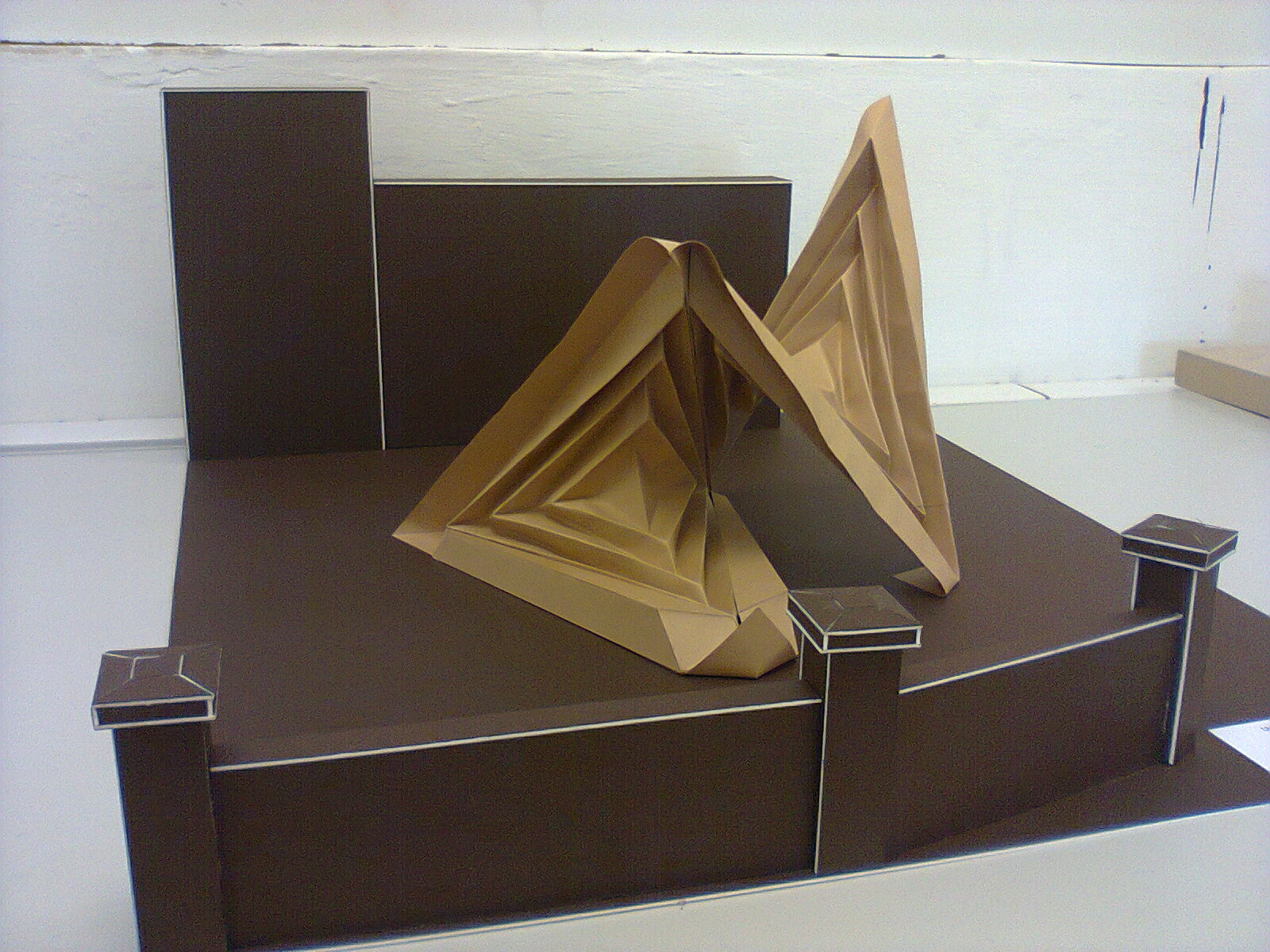
Pavilion Seating Model 1:20
As regards to the Pavilion designs I had proposed earlier, I decided that I should further my development on Proposal 1. The images show the model I managed to construct in carton paper and mountboard to create the Pavilion on site. The site I chose is next to the wood workshop, infront of the store.


Saturday, 10 December 2011
TV Set Design Proposal Chart

These images show my design for the TV Set from different cameras present in the TV Studio, aswell as two section views along with the plan. The set is basically constructed with 6 different arches to create depth and reflect the different backgrounds and lifestyles of the students, and a two-leveled platform to make it more interesting and thus enabling both guests and presenters to move more freely from one section to another. These views show clearly what each section of the set is used for. The band can perform on the right hand side of the set, the artist can work and display his works on the left hand side, while the seating area connects these both sections as it is placed in the heart of the set at the back. It runs along the small suspended bridge from the artist's area to the band's area to allow guests to move better, aswell as allowing better shots to be taken from the cameras especially the wide shot. The area where the band performs is designed in a more angular layout to allow the band to produce more creative performances; moving up and down the platform, aswell as using the jutted out edge at the front if desired. On the other hand the artist's area allows more space for the artist to work more comfortably on one flat surface and in addition he can display their works either along the edge of the platform's lower level or even surrounding him on the working area.
TV Set Design Proposal for "Int Min Int?"

Isometric View

Wide Shot

Right Camera Shot

Crane Camera Shot

Left Camera Shot


Section A

Section B
Wednesday, 7 December 2011
TV Set Comparisons & Contrasts
SABC Set for the 2010 Fifa World Cup


Red Carpet Set


3Talk with Noeleen Set


Rowdy Set


Fridays Live Set


When comparing all five TV sets, I would say that the best visual impact is between the the SABC, Red Carpet and 3Talk Set. The SABC stands out because of it massive ample space which in addition has a very functional and interesting spatial layout. The arches are a feature which enhances this impact. On the other hand, the Red Carpet is classy and glamorous which creates an expensive atmosphere. The layout of this set is very simplistic and moderately functional. It comprises of 3 main areas which almost merge into each other thanks to the light-pattern grid prop. However, 3Talk has a more functional spatial layout because everything sits on one multi-platform space, which is not as big as the SABC Set. On the contrary, Rowdy Set’s spatial layout is not functional because it gives the impression of being quite scattered. Besides, most of the props and furnishings are not aesthetically pleasing either. The Set for Fridays Live gives a cheap visual impact due to its furnishings and props and is very small in size. Nevertheless, credit must be given to the student’s who not only built this set but managed to produce good constructional techniques as it is both assembled and disassembled in each of their shows. The best lighting is seen in the SABC set with use of vibrant colour changing effects in the pillars at the back with ROBIN 300 Washes. 3Talk’s lighting is SABC’s opposite, in white bright light. Due to the whiteness the colours don’t work well with the set, even yellow lighting within this set creates an unattractive warm feeling.

Subscribe to:
Comments (Atom)